A common problem faced by many people is to manage meetings across multiple time zones. Knowing the exact time to set meetings can be cumbersome if you have to calculate local time for each participants in your meetings. India’s time zone is GMT + 5.30, a 30 minutes offset makes mental calculations difficult during the conversions. And then sometimes you are away in another time zone and you have meetings with folks back home.
I use Microsoft Outlook to manage all my meetings and it provides a simple option that helps visualize your calendar in a way that makes looking at multiple time zones and meetings very easy.
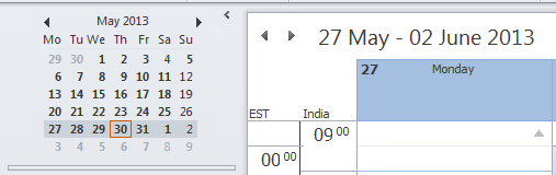
You can show two time zones in Outlook, I have set India and EST (Eastern Time) zones. There is no need for mental calculation or otherwise in these two time zones. I can see both times side-by-side.
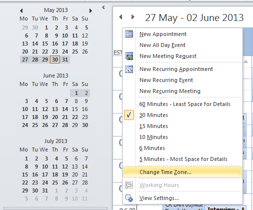
To enable this view, go to Calendar view and right click to “Change Time Zone…” and “Show a second time zone”.
In my opinion this is a problem well solved with good Data Visualization.
What other common problems have you seen solved by good data visualization?
Data visualization is an interesting problem to solve. I have seen several use cases where two or more entities are being compared. For example, the stock history. Take a look at this http://demos.kendoui.com/dataviz/dashboards/stock-history.html
Other interesting use case of it would be infographics; take a look at visual.ly, they have created a market place for infographics, example:
https://marketplace.visual.ly/static/patent-wars
I liked the patent war infographics.Very nicely summarize what is going on. I wonder if it was an interactive graph, I can see the value of suits on each of those lines?
I am seeing graphs of above type becoming popular to provide a high level visualization. In fact one of my lined up posts will make use of something similar.
Do you know if there is a name for such infographics?
I have never played with kendoui. Does it have a very powerful charting library? Is it similar to ZingChart?
Kendo gives a more richer experience than ZingChart. Comparing http://www.zingchart.com/#chart-gallery with http://demos.kendoui.com/dataviz/area-charts/index.html
Is there anyway to subscribe to post comments? I didn’t receive any mail when you posted the above comments.
Added a new plugin that should allow subscribing to posts with or without a comment.
Please try out and let me know if it is working fine.
One interesting library is d3.js(saw it in JS foo last year). Here some of their demo sites:
http://d3js.org/
http://www.jasondavies.com/coffee-wheel/
http://bost.ocks.org/mike/nations/
BTW nice to see you blogging Hemant 🙂
Thanks for the links Kunal. I will have a look.
You can check for koolchart also its also a very helpful charting library.
http://www.koolchart.com